Friday 11 February 2011

Adobe Illustrator CS2 - South Park


We had to make our own South Park character to know how to use Adobe Illustrator CS2.

We have to create all different type of shapes and like circles, rectangles etc.

We used all different  types of tools, to get the hair spiky and the rectangles to curve. 

T-shirt Design Production - Evulation


Evaluation

In this Assignment Brief we had to design a T-shirt for  “Creative Arts”.

The first thing we had to do was to make a questionnaire, to see what people would like on their T-shirts. To get make the questions for the questionnaire we had to think of what thing the like e.g. music, film, colour and if they like write, picture or both on the their T-shit.


Secondly we had make 3 designs for our T-shirt

Design 1
 

This is the first design I made by using a website called Picnik.


I have used different stickers and changed the colours to make the design stand out.


 The feedback I got from this design
  • Brightly coloured
  • Good design
  • Stands out
  • Too much stuff 

ch  Design 2
fh
This is the second design I made. I have still used the website Picnik.


I used similar stickers and I’ve put a few music notes and cameras to show that it’s about performing and music. The splodges in the background represent art. 


The feedback I got from this design:
  • Good design
  • Less crowded
  • Show what the brief asks
  • Good text/writing


 Design 3

This is the third design I made, again I used the website Picnik.


I got the original image from Google. I then added a few stickers/images, colours and writing to finish the design. I have got the music notes and the cameras in this deign to match the brief.


The feedback I got from this design:
  • Good colours
  • Writing stands out
  • Brightly colours
  • Stands out


Thirdly, We made a PowerPoint to present what we have found out in the questionnaire and to see how many people like music, film etc. but also finding out whether people like writing, pictures or both on their tops.

I gathered all the information from our questionnaire and made a graph to make the information easier to understand and be able to read clearly. On one of the questions ‘What design do you like?’ we had to put 4 rough ideas of T-shirt designs to see what they like more, which will also make it easier for me (the T-shirt designer) to get a better idea to create.

We also created a mood board to show what ideas we have research.


After we presented our 3 ideas to the class we keep the feed back and see which one most people liked and I have to make a new design within  ‘Design 2’ and ‘Design 3’.
The new Design I made for my T-shirt design.


I had to go into Photoshop to mirror the picture iron onto a T-shirt. I used an inkjet printer onto a peace of digital transfer paper. After it got printed I transferred it onto a plain white T-shirt and used an iron to transfer the design onto the t-shirt.


The feedback I got from my final design was it shows all the different Types of creative arts in the idea. Also people have said that it’s a really good design and very colourful and even by using a few colours. Also the writing stands out because it a bright colour.

The colours I used blue, purple, white & orange. The colours go together because they are simple and easy to stand out and they go very well.


The Print Production what we could use is Screen Printing. By doing this it would be a longer process because you would have to cut out each shape onto the t-shirt and mixing the paint to the right colour too. The Artist that would use Screen Printing would be Samuel Simon.


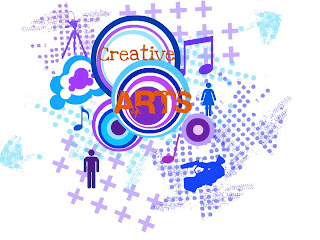
My conclusion of my final t-shirt design, I think it a lot better then the other ideas because is simple and there’s not too much go on within the design.  You can get a rough idea of what the creative arts is about by looking at the t-shirt as it has got; the girl and boy, camera/tripod, music notes and the arty creative design.

The advantages of my idea are the colours and the design goes well. Not too much going on, simple idea.

The disadvantages, there could possible be a few more colours and a few more stickers/images I could of used on the idea. 

Friday 4 February 2011

T-shirt Designing PowerPoint

 I had to create a question are to see what people liked and disliked on a t-shirt. We had to get the most popular answers from the questionnaire and put that into my design.

I made the PowerPoint and you can see the results that i got.


This is the the mood bored. To get some ideas for our t-shirt designs.


These are my 3 Design's that I made for my t-shirt design. i made these designs by using a program on the internet called Picnik. After making these i showed them to the class to get a review of which one people liked more. Most people liked the second one (lots of red and the 'Creative Arts' in the middle) and the third one (lots of blue and the orange, red, different shades of blue and the 'Creative Arts' in the middle). Because people liked them two the most I had to mix them together and create a new one. 


This is the final idea that i made and printed onto the t-shirts.

Friday 22 October 2010

Print Process

Intaglio (Dry printing)


we got given a peace of plastic with a compass and we had to trace a picture from a magazine, new paper etc. and scratching into it by using a compass. Then we put some oil paint on the plastic and we smudge it with a paper towel and by doing that it pushes the ink/paint into the cracks. After we then put it through a printing press with a peace of wet paper onto of the plastic. 


Disadvantage:
The problem with this when you scratch onto the plastic, you have to make sure you do the writing in reverse. 


Advantage:
The colour ink/paint has gone into the cracks and not still on the plastic screen. 


Screen Printing


We cut out a stencil, then taped it on a screen. After putting paper under the screen we put some ink/paint on the screen then pushing the squeegee with the paint pushing it down and pulling it towards you. By doing this the ink goes through to the stencil and go onto the paper.


Disadvantage:
when cutting out the stencil you have you make sure theres no loose pieces (e.g. when cutting out a O you have to make sure the middle of the O is still attached to the stencil).


Advantage:
The ink went through good and didn't smudge or anything.


Lino Printing


We got given a peace of Linoleum and drew a design onto it by using a ball pen. We cut the peaces out by using a cutting tool. we had to choose which part of the design we were going to take out. After we the got 2 rollers and some acrylic paint. Then put the 2 colour next to each other and get one of your rollers and roll through them so you get the paint on the roller then use that same roller and paste the paint onto the linoleum. The linoleum would then have the colour(s) on it. Next, the linoleum goes onto a peace of paper, painted side, and use the clean roller and push on the back of the linoleum to get a print onto the paper.


Disadvantage:
I choose to cut out the background but then decided to cut out the tree part. Had to get part of my peace cut off. 


Advantage: 
The colours came out well and the design showed nicely.

Friday 10 September 2010

The adventures of Apple Head

Apple head is thinking about robbing a bank. While he has a gun in his left hand and a sword in his right hand. He has crazy eyesight, a good sense of smell and his ears are as big as dumbo's. Apple head has so many arms so he can carry out loads of bags of money. On one side of his legs he has strips and the other side he has spots, Apple head can hypnotise the till workers by doing a chicken dance.